How to analyse a photograph
We see hundreds, if not thousands, of images every day. We live surrounded by images—so much so that we hardly even pay attention to them anymore.
The thing is, looking is not the same as seeing. And looking attentively, even less so.
Works of art require that type of looking. They require time to understand what they are, what the artist intended when making them, and how we, as viewers, receive them. There are many heady theoretical analyses regarding this overlap of looks and times. But today, I’m going to stick to the practical side: how to analyze a photographic image.
First off, let me say that this is not an exact science, far from it. Nor is there only one way to do it. But theorists, despite their differences, generally propose something similar to what I’m describing in this entry.
To start at the very beginning, the first thing is to understand that an analysis has two stages or phases: the denotative and the connotative. These two scary words are easily translated by saying that first you have to analyze what we see in the image, and only afterward will we get into what that which we saw means.
And to illustrate the method with an example, here is a piece by the man who is, in my opinion, the best portraitist of the 20th century:
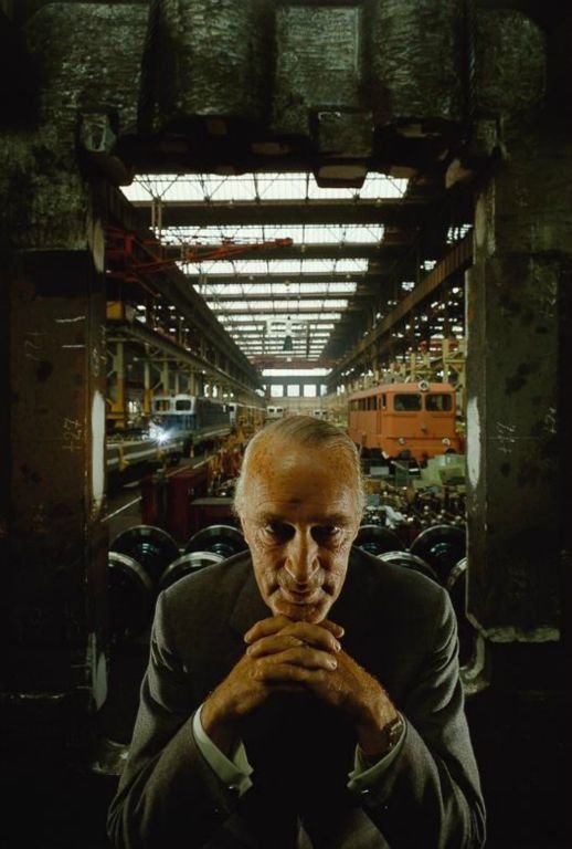
Alfried Krupp, Essen, Germany. (Arnold Newman, 1963). ©Arnold Newman Estate.
The Denotative Analysis – What is seen?
This is about observing every element of the photograph and describing it, but without trying to interpret why it is that way. It seems easy, but leaving our subjectivity aside is not.
As is almost always the case, the best thing is to divide the analysis into parts to maintain an order: first a general description of the image, then a description of light, color, and forms. Finally, relate all these elements within the composition and format.
Let’s get to it: we are looking at the portrait of a white man around 60 years old, dressed in a suit inside an industrial factory bay.
So far, so good, right? 😊
Light
The photographer has divided the image into two distinct lighting areas: the background and the foreground. The coverage in the background is broad—that is, the light reaches every corner and allows us to see the background elements clearly. But in the foreground, it is not the same: there are zones in deep shadow. We can see the man's face and hands clearly, but it is impossible to make out the details of the suit or the immediate environment surrounding the man.
The light is hard: the transitions between illuminated areas and those in shadow are marked and sharp.
Regarding the direction of the light, again, it differs by zone: in the background it is overhead (cenital), through the skylights on the ceiling. But in the foreground, the light comes from both sides, probably from lights set up by the photographer. Looking at how shadows are projected on the face and sleeves, they seem to be placed almost at 90º relative to the camera (meaning, completely sideways to the subject).
The photo has a high tonal range, which means there is a lot of luminosity distance between the brightest point (the skylights) and the darkest (the space under the hands). But the contrast is medium. Contrast is easy to confuse with tonal range because they are often used as synonyms, but in reality, contrast is the quantity of luminosity levels present in an image. In this case, there is a bit of everything: bright areas, intermediates, and deep shadow. This is why it is medium contrast. A high-contrast image would only have highlights and deep shadows, with nothing in between.
Color
The entire photo has a greenish cast, but this might be due to the preservation of the print. Although it is a color image, there are no elements that stand out too much. There is low chromatic variation: the skin tone, the red of a vehicle in the background, another blue element, and the rest is basically greenish-grey.
The colors are lowly saturated (desaturated), that is, they tend toward grey, and are also darkened, as if mixed with black. These two chromatic concepts are also sometimes mixed up. Saturation is how intense/dull a color is—whether it has a lot of "pigment" or seems mixed with grey. Luminosity is how light/dark it appears: lighter if white is added, and darker if black is added.
If we look at all the tones together, since most are variations of grey, we would say there is monochromatic harmony, with a contrast found in two warm accents: the skin and the red wagon.
Form and Space
Now, it’s about reducing the elements of the image to simple geometric forms: square, triangle, circle. Without a doubt, the most important form in the image is the circle, or point, formed by the sitter’s head. Let’s say it is the first thing that catches our attention. From there, the hands joined under the chin form a triangle right below the circle.
Behind the man, there is a rectangle that frames him, formed by the beams or walls surrounding him.
Regarding the space within the framing of the photo, there is a clear central vanishing point, marked by the lines drawn by the skylights on the ceiling. There is a sense of depth: the background plane is perceived as distant from the foreground. There is depth of field, so we clearly see the protagonist but also distinguish a reasonably focused background. In this way, we can place the character in a context.
Format and Composition
The image is very vertical: there is an immense amount of "air" above the character but very little below and on the sides.
It is a medium shot with a slight high-angle. The man is probably sitting and the camera is on a tripod at the height of the standing photographer, so we view the protagonist from a level above his eyes.
As for the composition, the image is highly symmetrical: the man is completely frontal to the camera and occupies exactly the vertical axis that divides the image in two. The frame surrounding him is symmetrical, and even the background, where there is more variety of elements, arranges them relatively symmetrically.
The image is balanced (nothing seems to "fall" to one side) and is static; it does not produce a feeling of movement, which is typical of portraits. The centrality of the vanishing point and the feeling of head support on the triangle formed by the arms also contribute to this static quality.
Now, let's look at rhythm, which occurs in an image when there is a repetition of elements. In this case, the ceiling skylights and the bay's beams. Even the rolls of material behind the character. Since they repeat at very regular intervals, this is called quantitative rhythm (don't ask me why it's called that).
Only one thing is left to analyze: visual weights. Clearly, the element of greatest weight is the subject being portrayed; everything else seems to "orbit" around him. The skylights also have visual weight due to the contrast in light, and thus balance out the weight of the human figure. Put another way: the photographer has carefully thought out the framing so that the composition is ordered and harmonic, and our eyes travel the image in the order he wants: first the man, then the rest.
This is also normal in a portrait: if there is a face, we instinctively seek to cross our gaze with that of the character. If this person also looks directly at us, it will be difficult for us to turn our eyes away from theirs.
So, how are we doing so far? Still with me?
The Connotative Analysis – What does it mean?
Now comes the fun part. Every element seen in the photo is that way for a reason; the photographer has an intention, and now it's our turn to fit all the pieces of the puzzle together to interpret what that intention, that message, is.
This is not an "innocuous" portrait, like a passport photo. Here, the photographer has made decisions that imply a certain attitude toward the sitter. For example, the hard and completely sideways light is not flattering, because it produces aggressive shadows on the face that transmit severity. And in the eyes, the outer part is well-lit, but the inner part is in deep shadow. In portraits, it is standard for eyes, as the most expressive part of a face, to be seen perfectly, but here Newman has left them partially hidden.
If we look at the character's posture, although he is at rest, he does not seem relaxed; there is bodily tension and a sketched-out smile that seems more like a rictus, a grimace. Between that position, the high-angle shot, the side lighting, and the character's features (the aquiline nose, for example), to me, it transmits a feeling of a bird of prey.
The photographer puts distance between character and observer; that is, we are not participants in the scene, even though the man looks at us. I’m not talking about physical distance, but emotional distance. There are photos where it seems like we are "inside," with the characters. Where we empathize with them. That is not the case here.
The lowly saturated, low-variety, and darkened color produces a feeling of something old, even decadent. To me—this is something a bit more personal—that greenish-grey produces a certain repulsion, like something rotten.
Since we are in an industrial space, everything is hard: concrete, metal... There are no kind or welcoming elements. The sensation is one of hardness, even rigidity, which we must add to the rigidity of the character.
The static nature and centrality of the composition seek timelessness. We haven't caught the character in the middle of an activity. The photographer wants to transmit what the subject is, not what he is doing at one particular moment (here I really miss the non-existence of two verbs in English for the Spanish “ser” and “estar”).
In portraits, the most common practice is to place the person against a neutral background or out of focus, but here we can clearly see the industrial bay. For Newman, it is important that we locate the man in a specific place: that workspace where, curiously, there are no people. The protagonist appears completely isolated. Where are the workers? This contrast, combined with everything I have described above, transmits evident narrative tension. Something doesn't add up in this photo. But what? The photographer doesn't give us more clues, but if we connect everything, the lighting and color that are not flattering, the tense posture, the rigidity of the framing, the lack of empathy, the hard and solitary environment... what conclusion do we draw?
It seems that Newman didn't like this man very much.
The Conclusions
Be careful: in a connotative analysis, we can interpret quite freely, but we cannot invent things. The interpretation must be based on things found in the photo. The light, the color, the composition... we can base ourselves on all that to say that it is not a friendly portrait of the character, but we cannot say it is because the sitter "looks like a cousin of mine from Burgos who is an idiot." Am I making myself clear? In that sense, knowing data about the photo itself should not be part of the analysis, either. It is impossible not to take it into account, but to do it right, we have to set that aside and look at the image and how the elements play against each other.
In this case, the story behind this photo perfectly explains why Newman made the portrait this way. I have told this story here, and I recommend reading it because it is the final piece of the puzzle. Newman was a master. And with this photo, he managed to transmit a message—clear, powerful, undeniable—without saying a single word.
Do you understand now why I consider him the best portraitist of the 20th century?
Notes:
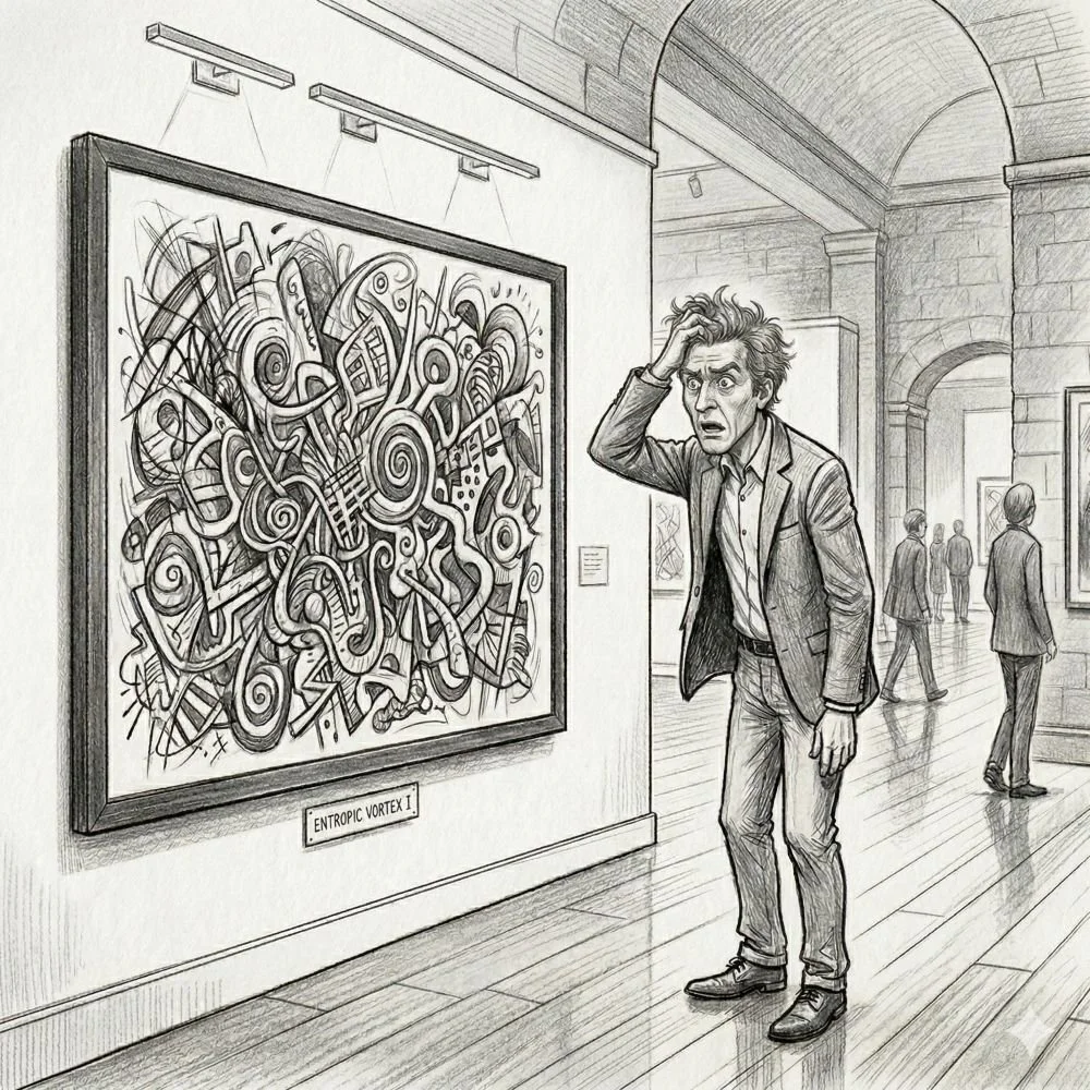
The illustration opening this entry was generated using Nano Banana AI.
My deepest gratitude to Eric Newman and Getty Images for granting me permission to use this image on the blog.